Design Problem
The design challenge involved a magazine called "Dabble" with a tagline, "Screen Free Adventures for the Growing Mind". The main goals involved:
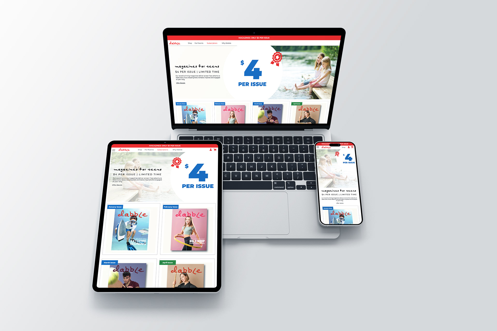
1. Creating a visually engaging and adaptable magazine cover design that could easily be replicated for future issues.
2. Create a table of contents style and a few inside spreads that demonstrate the grid system used in the magazine, ensuring readability and visual appeal for young readers.
3. Developing inside spreads that have a balance of content and graphics/ photos in a a way that is easy for young readers to navigate and are also visually appealing.
4. Including elements that resonate with young readers (i.e the target audience), such as playful typography and vibrant colors.
Design Solution
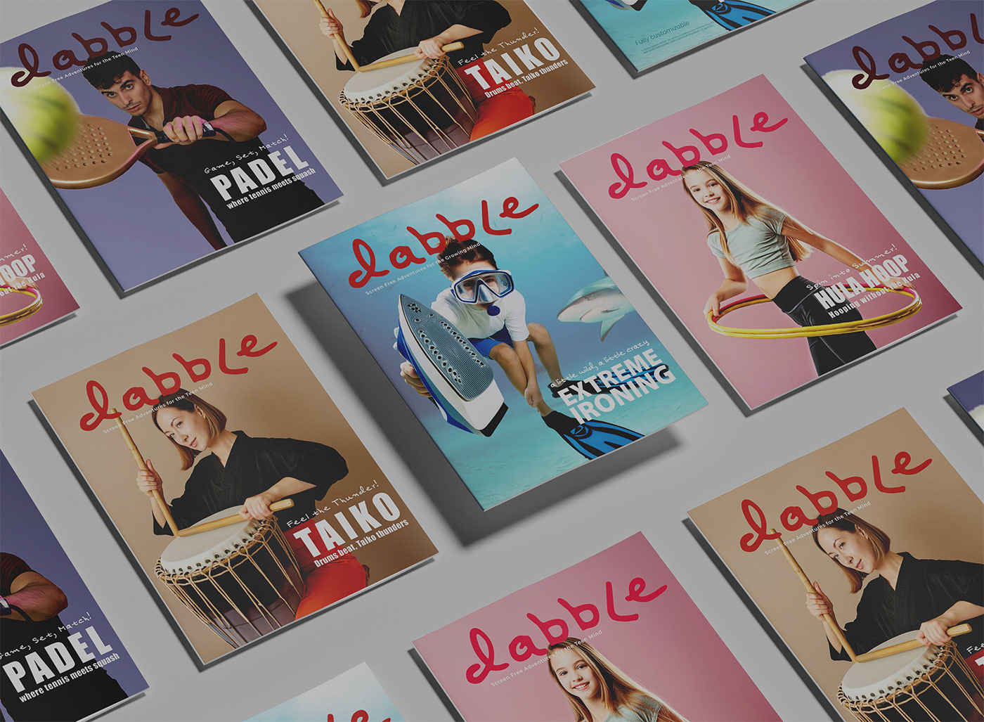
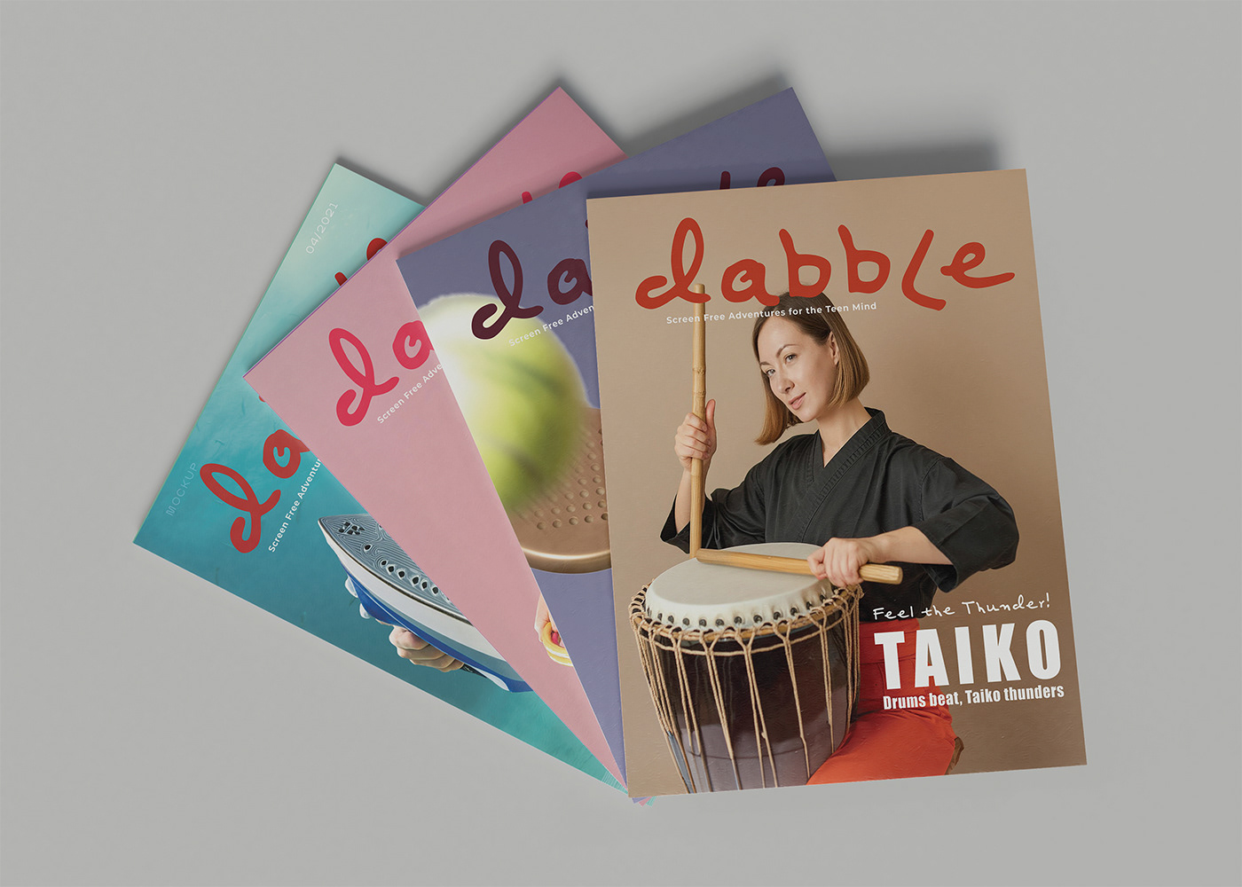
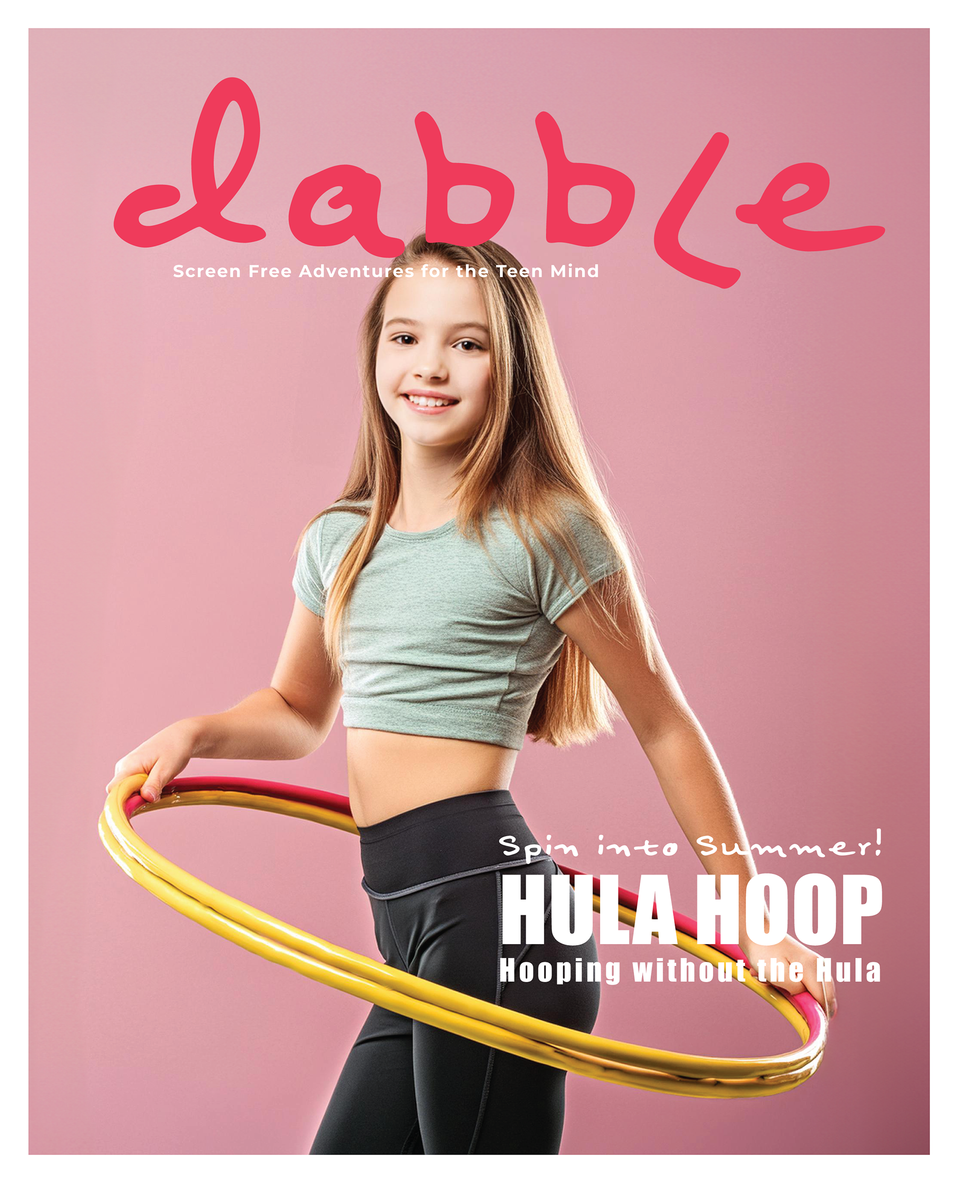
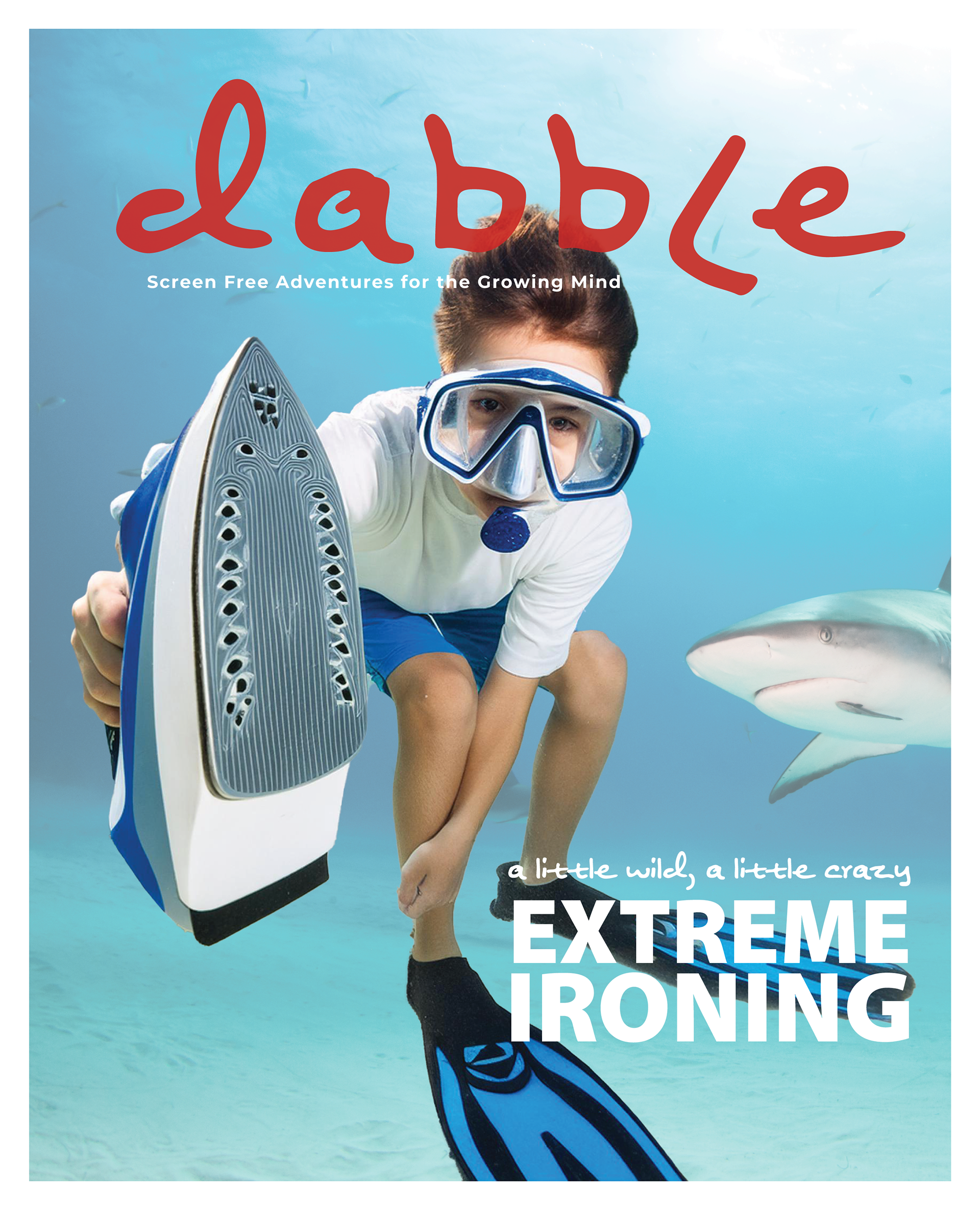
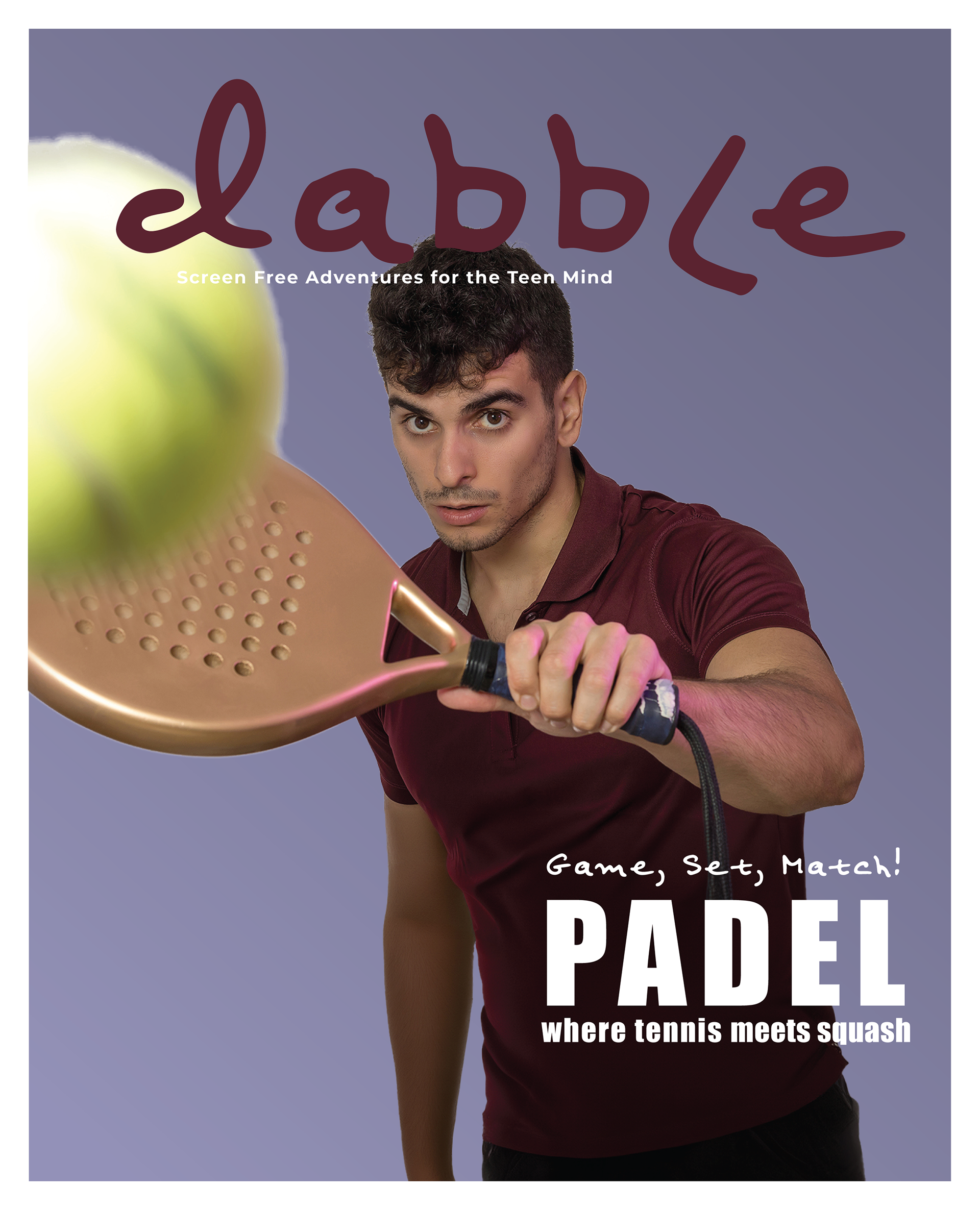
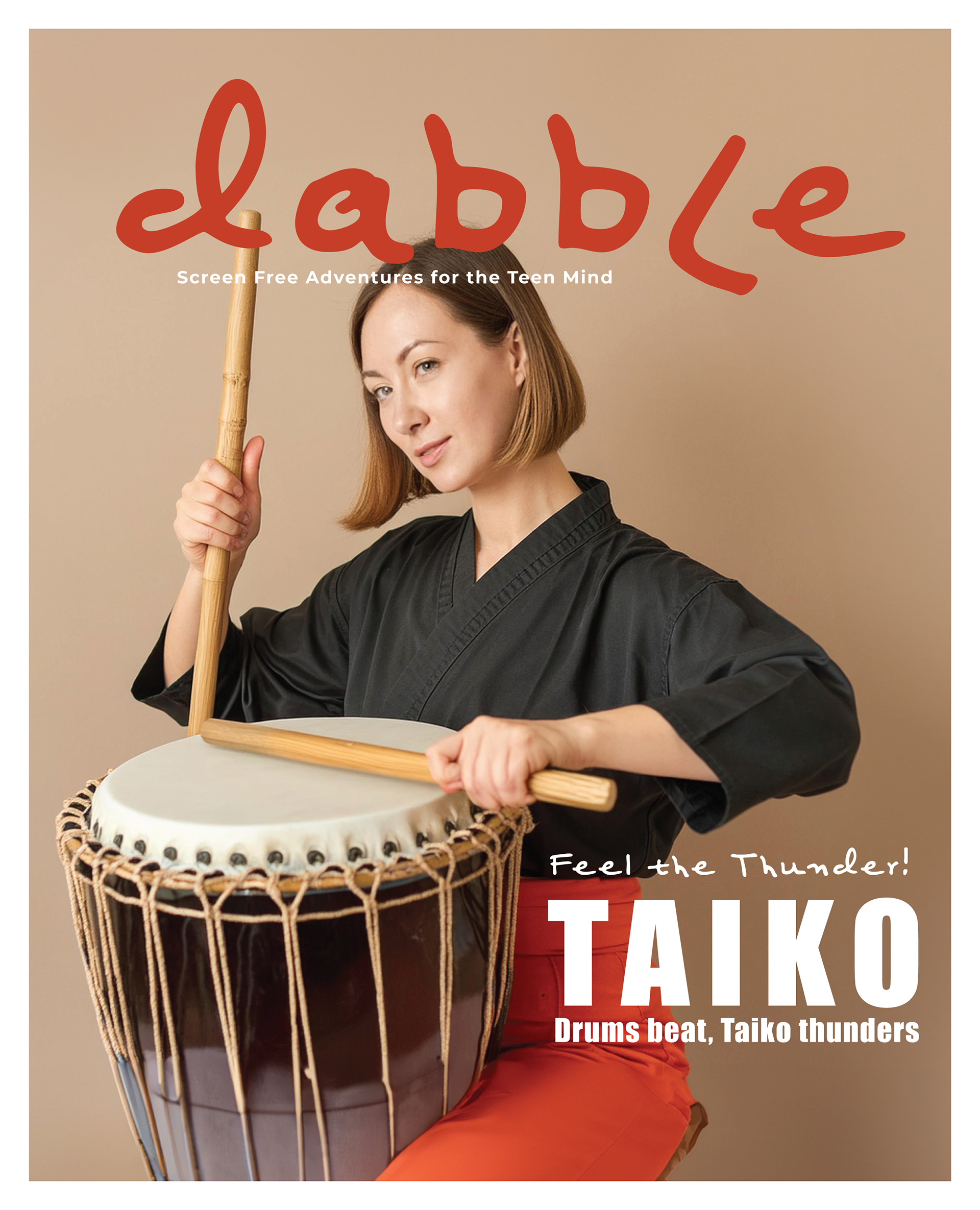
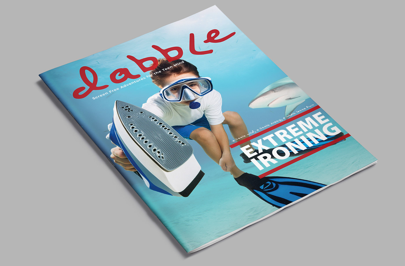
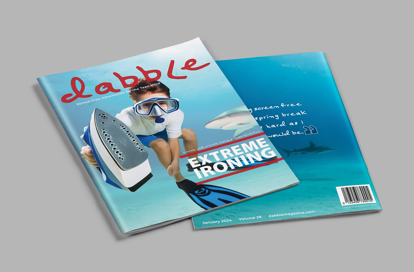
Since this was a fictitious magazine, the first task was to create a logo for the magazine. Below are the original logo iterations. I began with the interpretation of the word, “dabble” as in “dip your toes” into multiple activities. Thus, the lower parts of the logo are meant to look like water ripples and the L was to represent a foot. However, I realized, this logo wouldn’t be work with a magazine cover design system for monthly publications. Thus, I simplified the logo.
I chose the font Felt Tip Senior and used lower case, except for the capital L (to still maintain the impression of a leg”. This font was chosen as kids/ teens are always writing with markers and also because I’m a teacher.

Magazine Content
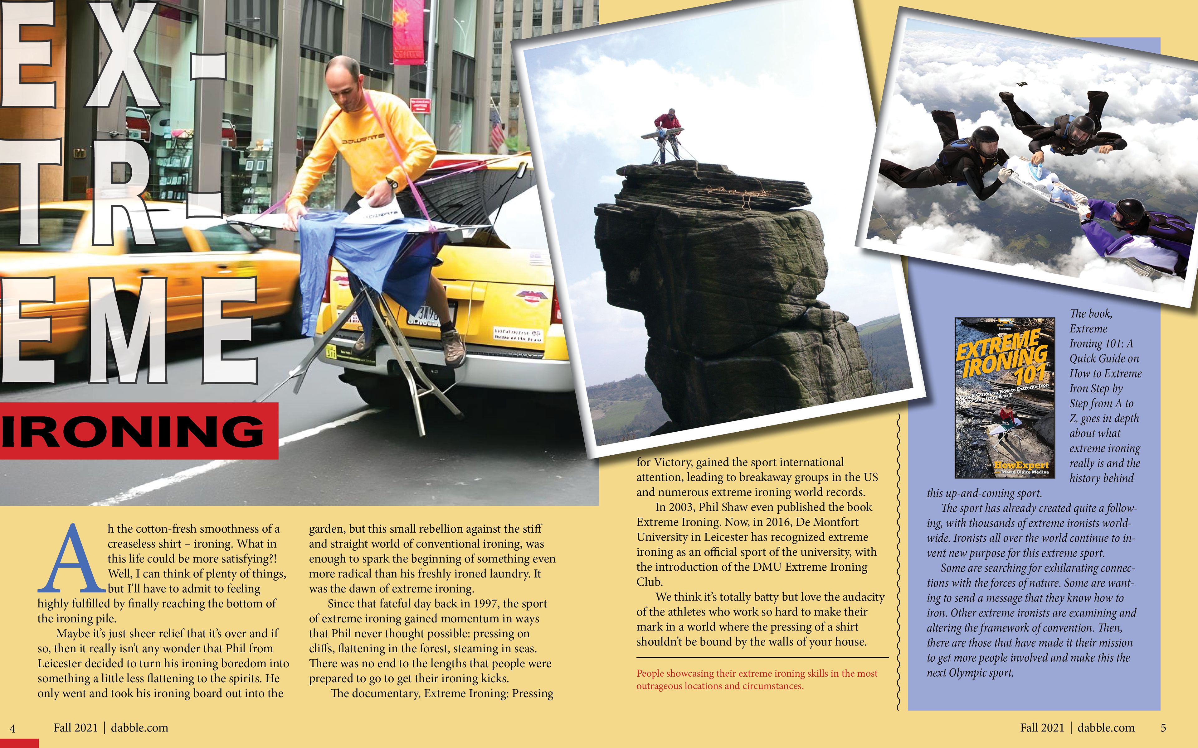
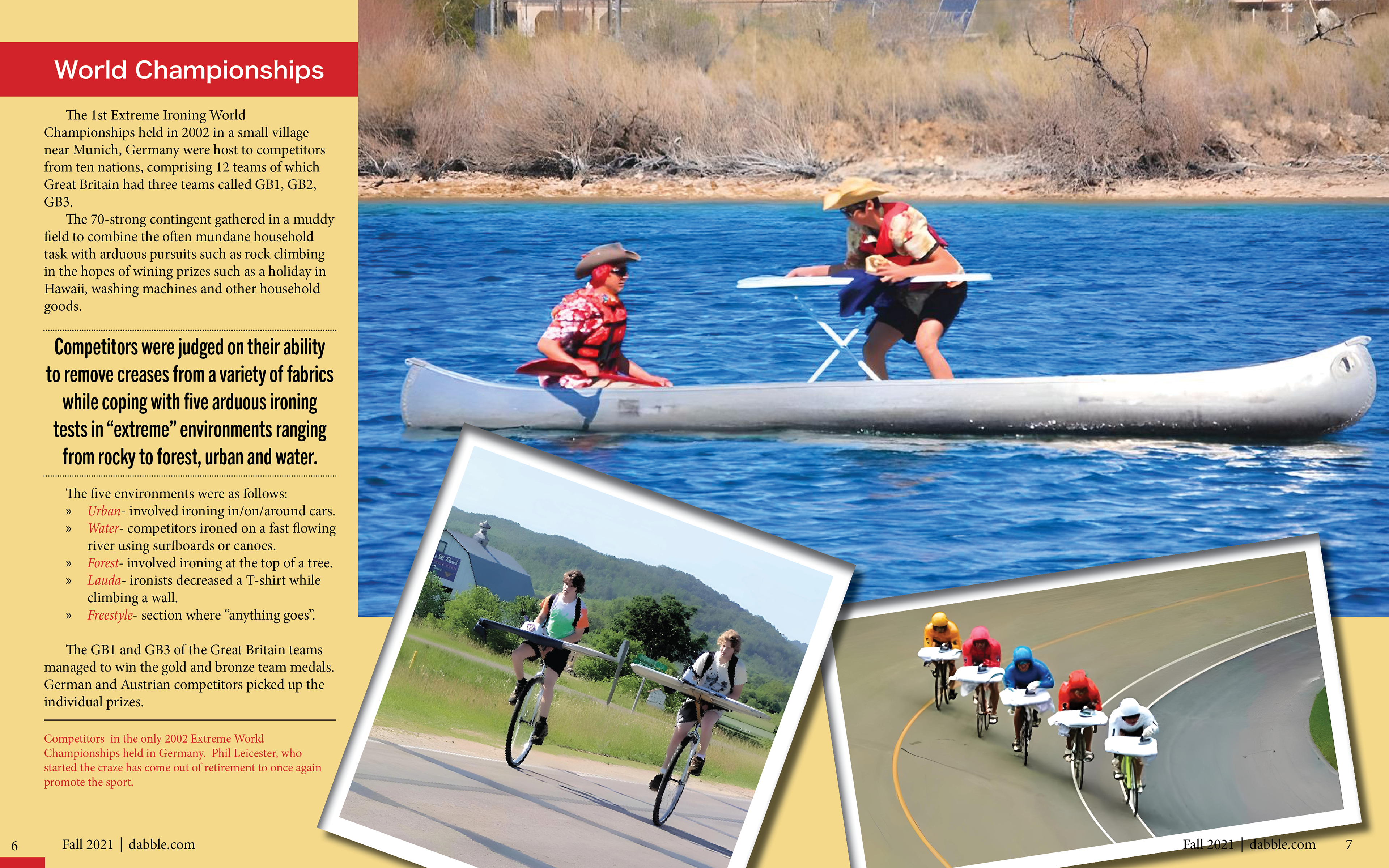
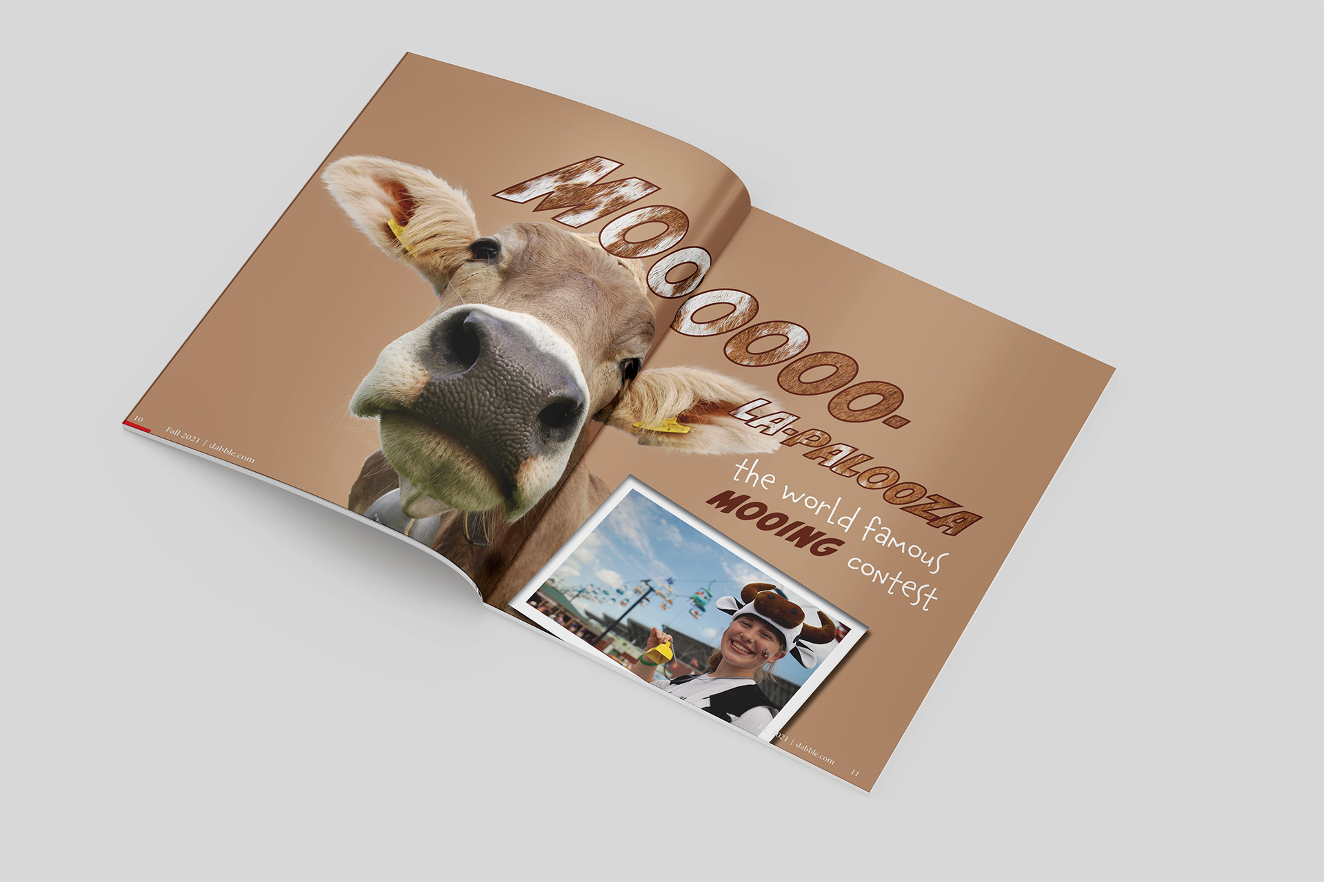
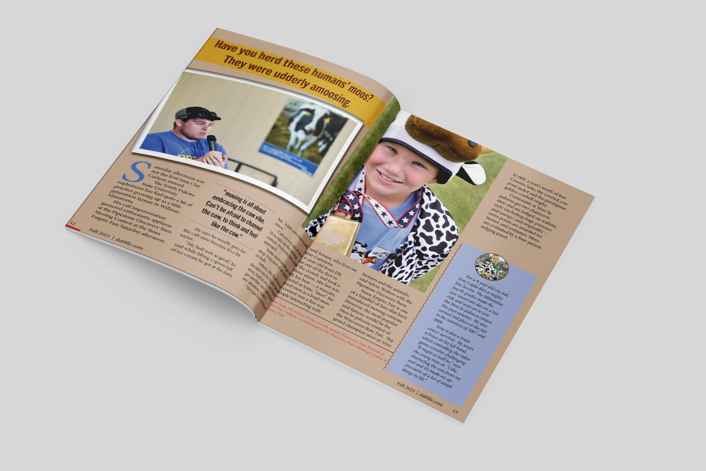
The magazine's goal is to offer children alternative to screen time. The stories try to grab young readers' attention with bizarre activities such as extreme ironing, mooing competitions, etc.
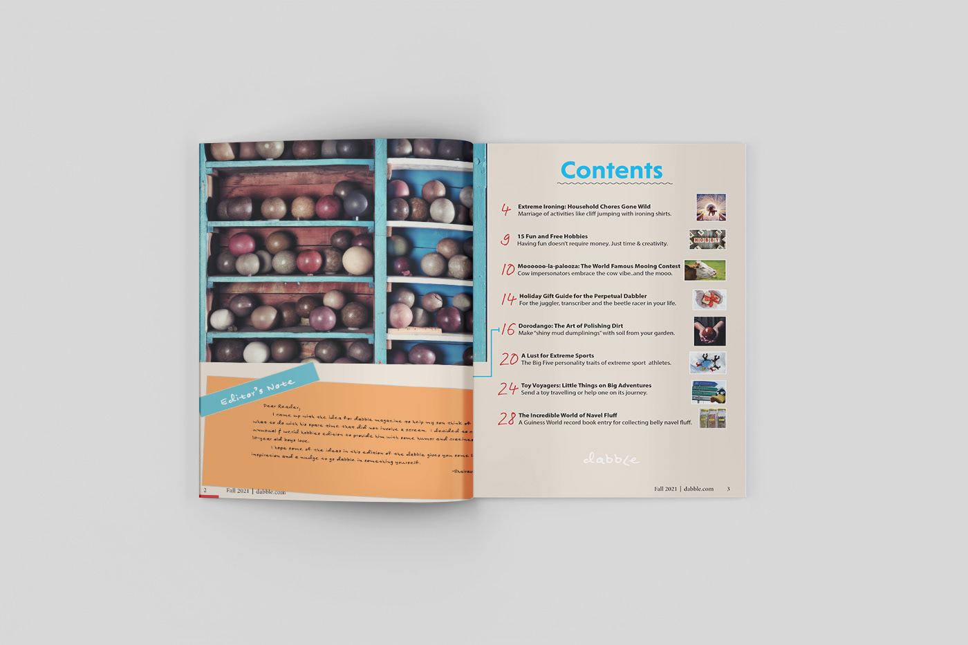
The Table of Contents aims to give clear descriptions of the different activities highlighted in the magazine.
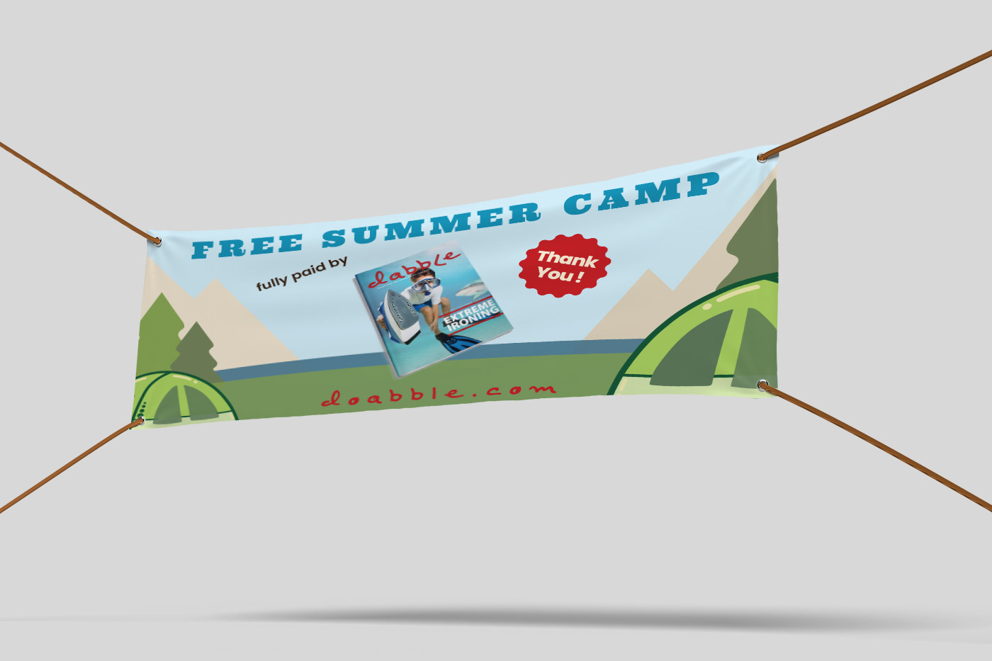
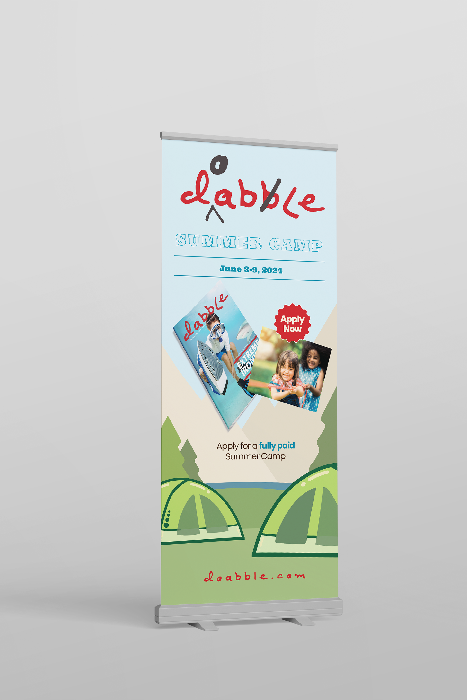
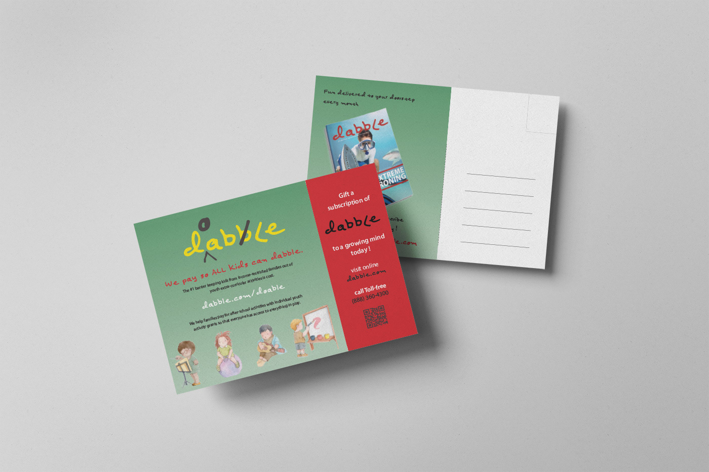
Expansion Kit
1. An advertisement vertical banner to encourage applications to a summer camp that will be fully paid by Dabble Magazine.
2. A banner that can be displayed at the entrance to the summer camp to make the public aware that Dabble Magazine provided the funding for the camp.
3. A mailer post card sent to clients by Dabble to encourage gifting magazine subscriptions for families in need.